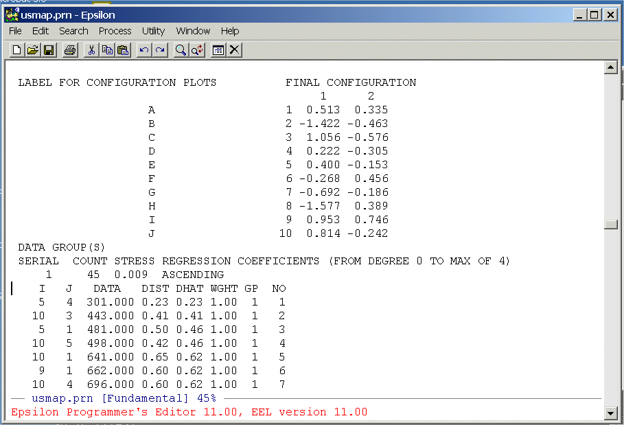
The columns we need are below the labels "DATA", "DIST", and "DHAT". We are going to extract these from the file and write them to a text file that we can then read into R. To do this we are going to write a simple Epsilon macro. First, split the screen:
C-X 2 (Split Window Command)
Now use the
C-X C-F (Find File Command)
command to get an empty file -- junk.txt. You should see:
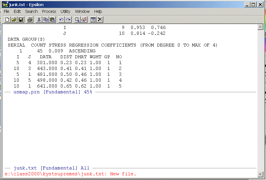
Highlight the data from the line below the labels on down -- there will be 45 rows -- and put it on the clipboard. Now close the upper window
C-X 0 (Removing/Creating Windows Command)
and paste it into junk.txt, save junk.txt, and position the cursor at the top of the file. You should see:
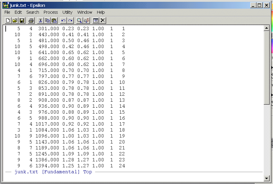
- Write a simple Epsilon macro to
remove the first two columns and the last three columns. List your commands
and turn them in.
- Use the following R program to make the Shepard Plot:
 Shepard_Plot_Driving_Distances.r
Here is what the program looks like:# # # # Shepard_Plot_Driving_Distances.r -- Does Shepard Plot of Driving Distances # for Cities Problem in Homeworks 1 and 2 # UCSD 2006 # # # Remove all objects just to be safe # rm(list=ls(all=TRUE)) library(MASS) # T <- matrix(scan("C:/ucsd_homework_1/driving_distances_ordered.txt",0),ncol=3,byrow=TRUE) # You Created this in Question 1a nrow <- length(T[,1]) ncol <- length(T[1,]) # This sets up a plot with the horizontal axis plot(T[,1], T[,2],type="n",main="",xlab="",ylab="", being the observed data (DATA) and vertical axis xlim=c(0,3200),ylim=c(0,3),font=2) being the reproduced distances (DIST) points(T[,1], T[,2],pch=16,col="red",cex=1.2) This Plots the Distances (DIST) points(T[,1], T[,3],pch=16,col="blue",cex=1.2) This Plots the D-HATs (DHAT) # # The "S" means "stair-steps" # lines(T[,1], T[,3],lty=1,lwd=2,type = "S",font=2) Draws lines between points essentially in # "city block" style # Main title mtext("Shepard Diagram for Driving Distances",side=3,line=1.00,cex=1.2,font=2) Side 3 = Top # x-axis title mtext("Observed Dissimilarities",side=1,line=2.75,font=2,cex=1.2) Side 1 = bottom # y-axis title mtext("Estimated Dissimilarities (D-hats)",side=2,line=2.75,font=2,cex=1.2) Side 2 = left side #Note that the stairstep plot is almost perfect. We can see this by computing the Pearson correlation between the driving distances (DATA) and the distances from the spatial map (DIST). This can be done with the simple R Command:
cor(T[,1],T[,2])
Compute this correlation and the one between the driving distances and the DHAT's from the Monotone Regression. Report the correlations and turn in the Plot.
PRINT HISTORY,PRINT DISTANCES
as shown below:
TORSCA
PRE-ITERATIONS=3
PRINT HISTORY,PRINT DISTANCES
DIMMAX=2,DIMMIN=1
COORDINATES=ROTATE
ITERATIONS=25
REGRESSION=DESCENDING
DATA,LOWERHALFMATRIX,DIAGONAL=PRESENT,CUTOFF=.01
U. S. SUPREME COURT AGREEMENT SCORES
 32  1  1
(12X,101F3.0)
BURGER      100
BLACKMUN     81100
etc etc etc
etc etc etc
Now run KYST as described in Question 1) of homework one. Bring the Printer Output file (SUPREME.PRN or whatever you want to call it) up in Epsilon and page down until you see the following:
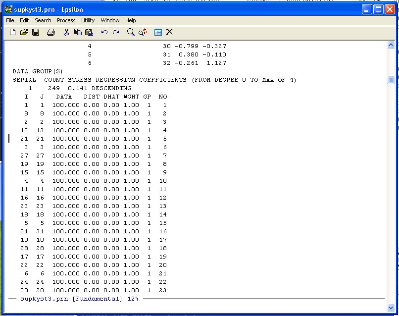
Unlike the other examples we have done note that the diagonal entries of the Agreement Score Matrix are at the beginning of the DATA-DIST-DHAT listing. We are going to discard these diagonal entries because they inflate the fit. Namely, given the 32 points representing the Justices, you will always get the distance between the Justice and himself/herself correct -- 0.0! So we exclude these from the Shepard Plot. Scroll down until you see the following:
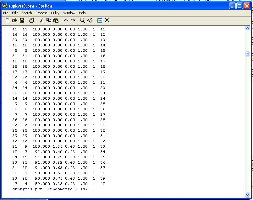
Note that the agreement score between Justice 21 and Justice 9 is 100 so we leave it in. We only want the data from here down.
To select this line and below we can highlight it in normal WINDOZE style (pretty tedious if there are several thousand lines to highlight!) but it is easier to use the Set Mark Command in Epsilon. Namely, type:
C-@ (Hold down the CTRL key and type @ -- Set Mark Command)
You will see:
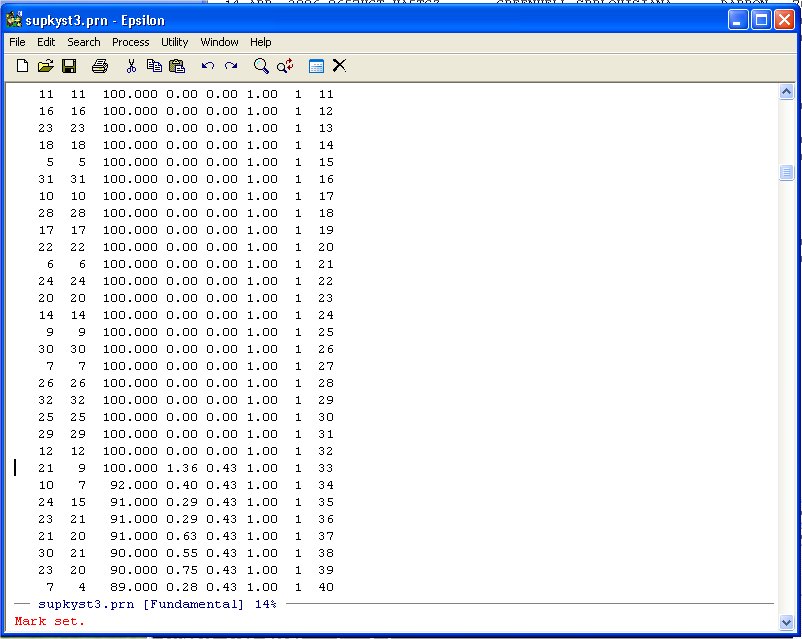
Now simply use Page-Down until you get to the end of the DATA-DIST-DHAT listing:
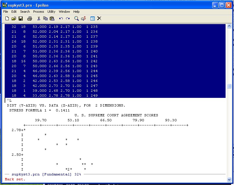
and put it on the Clipboard. Now use the Find File Command:
C-X C-F -- ("Hold the Control key down and type X then hold the Control key down and type F")
to open an empty file (any old name you want, I used MYSUPREMES.TXT):
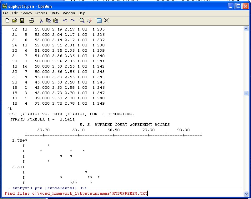
Hit Enter and Epsilon opens the file and you can paste the data into the file. You can use the normal WINDOZE paste or the Yank-Buffer Command in Epsilon. Namely, type:
C-Y -- ("Hold the Control key down and type Y")
and you will see:
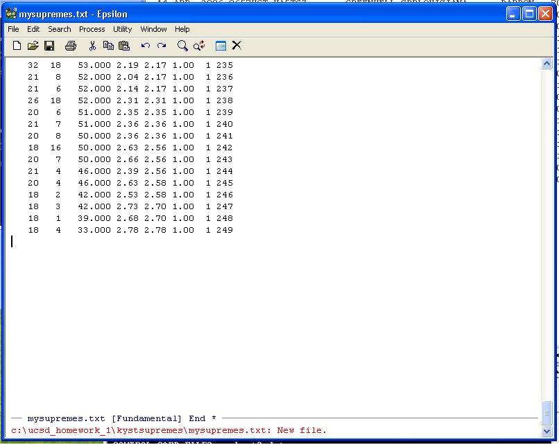
Note the * at the end of the black banner at the bottom on the window above the message line in red. This means that the file has not been saved yet. You can do that with the normal WINDOZE save command or use the the Saving Files Command in Epsilon. Namely, type:
C-X C-S -- ("Hold the Control key down and type X and then hold the Control key down and type S")
At this point it would be pretty useful to know how many lines we have in our file. To do this we can use the Count Lines Command in Epsilon. Namely, type:
C-X L -- ("Hold the Control key down and type X and then type L")
and you will see:
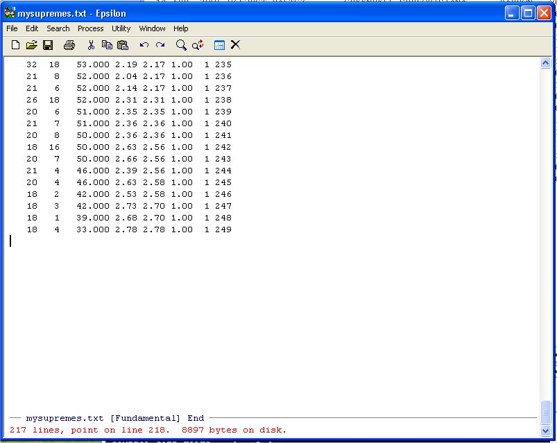
Epsilon tells us that we have 217 lines. What Epsilon does is count the Line-Feeds (in old computers this was a Carriage Return) or ^J (literally C-J). To put your cursor at the top of the file use the Epsilon Go To Beginning Command:
Alt-< -- ( "Hold the Alt key down and type <")
Similarly the Go To End Command:
Alt-> -- ( "Hold the Alt key down and type >")
Puts the cursor at the end of the file.
Apply the same keyboard macro you used for question 1.a. to get rid of the first two and last three columns and make the Shepard Plot.
Here is what the program looks like:
#
#
#
#  Drive_MDS.r -- Set up to do Simple MDS on Driving Distance Data
#
# ATLANTA      0000 2340 1084  715  481  826 1519 2252  662  641
# BOISE        2340 0000 2797 1789 2018 1661  891  908 2974 2480
# BOSTON       1084 2797 0000  976  853 1868 2008 3130 1547  443
# CHICAGO       715 1789  976 0000  301  936 1017 2189 1386  696
# CINCINNATI    481 2018  853  301 0000  988 1245 2292 1143  498
# DALLAS        826 1661 1868  936  988 0000  797 1431 1394 1414
# DENVER       1519  891 2008 1017 1245  797 0000 1189 2126 1707
# LOS ANGELES  2252  908 3130 2189 2292 1431 1189 0000 2885 2754
# MIAMI         662 2974 1547 1386 1143 1394 2126 2885 0000 1096
# WASHINGTON    641 2480  443  696  498 1414 1707 2754 1096 0000
#
#  Remove all objects just to be safe
#
rm(list=ls(all=TRUE))
library(MASS)
#
T <- matrix(scan("C:/ucsd_homework_1/driver2_full.dat",0),ncol=10,byrow=TRUE)
maxT <- max(T)            This finds the maximum entry in the 10 by 10 Matrix T
T <- T/maxT               This makes the maximum entry in T = 1.0
#                         This is handy because the R KYST Program does not like large Distances!
nrow <- length(T[,1])
ncol <- length(T[1,])
#
#
#  Labels For Cities      This is Just like problem 2) of Homework 1 -- Supreme Court Plot
#
junk <- NULL
junk[1] <- "Atlanta"
junk[2] <- "Boise"
junk[3] <- "Boston"
junk[4] <- "Chicago"
junk[5] <- "Cincinnati"
junk[6] <- "Dallas"
junk[7] <- "Denver"
junk[8] <- "Los Angeles"
junk[9] <- "Miami"
junk[10] <- "Washington"
#
namepos <- rep(2,nrow)    This is Just like problem 2) of Homework 1 -- Supreme Court Plot
#
namepos[1] <- 2    # Atlanta
namepos[2] <- 2    # Boise
namepos[3] <- 2    # Boston
namepos[4] <- 2    # Chicago
namepos[5] <- 2    # Cincinnati
namepos[6] <- 2    # Dallas
namepos[7] <- 2    # Denver
namepos[8] <- 2    # Los Angeles
namepos[9] <- 2    # Miami
namepos[10] <- 2   # Washington
#
#  Call Classical Kruskal-Young-Shepard-Torgerson Non-Metric
#           Multidimensional Scaling Program
#
# T -- Input
# dim=2 -- number of dimensions
# y -- starting configuration (generated internally)
#
#  Scale in two dimensions
#
kdim <- 2                 Set the Number of Dimensions
y <- rep(0,kdim*ncol)     The Program wants to see the matrix y so
dim(y) <- c(ncol,kdim)       we create it here
#
#  Call Kruskal NonMetric MDS
#
drivenmds <- isoMDS(T,y=cmdscale(T,kdim),kdim, maxit=50)  Here is the call to KYST.  Note that
#                                                           we store the output in the data
#                                                           structure drivenmds:
#  PLOT FUNCTIONS HERE                                      drivenmds$points[,kdim]
#                                                           drivenmds$stress -- multiply by 0.01
#
# Main title       Your Plot will be like this:
#                  plot(drivenmds$points[,1],drivenmds$points[,2],type="n",asp=1,etc etc
#
mtext("City Map",side=3,line=1.00,cex=1.2,font=2)
# x-axis title
mtext("",side=1,line=2.75,font=2,cex=1.2)
# y-axis title
mtext("",side=2,line=2.75,font=2,cex=1.2)
#
#
Modify this program to make a nice looking plot of the cities. Turn in the plot
and the final version of the above R program you develop
to do the plot.And here is what it looks like (different from the book at the end):
############################################################################################
# Example: SIMPLE GIBBS SAMPLING FOR BIVARIATE EXPONENTIAL                                 #
############################################################################################
#                                                                                          #
# This archive is part of the free distribution of data and statistical software code for  #
# "Bayesian Methods: A Social and Behavioral Sciences Approach" by Jeff Gill (c) 2002.     #
# You are free to use, modify, distribute, publish, etc. provided attribution.  Please     #
# forward bugs, complaints, comments, and useful changes to: jgill@ucdavis.edu.            #
#                                                                                          #
############################################################################################
#                                                                                          #
# This example shows the simple workings of a Gibbs sampler in the bivariate case where    #
# both are conditionally exponential.  Try varying the parameters such as B, k, and m.     #
# The graph can be modified to overly a density estimator.                                 #
#                                                                                          #
############################################################################################
#
rm(list=ls(all=TRUE))             I added this
#
B <- 5; k <- 15; m <- 500; x <- NULL; y <- NULL   Initialize Values
while (length(x) < m)  {
    x.val <- c(runif(1,0,B),rep((B+1),length=k))  Draw 1 uniform random number from (0,B)
    y.val <- c(runif(1,0,B),rep((B+1),length=k))  and fill the rest of the vector with 6's
    for (j in 2:(k+1))  {
        while(x.val[j] > B) x.val[j] <- rexp(1,y.val[j-1]) Draw 1 random value from the Exponential With parameter y.val[j-1]
        while(y.val[j] > B) y.val[j] <- rexp(1,x.val[j])   Take random value from above use it as the parameter
    }                                                         for an Exponential and draw a value randomly from that Exponential distribution
    x <- c(x,x.val[(k+1)])         Store the Values
    y <- c(y,y.val[(k+1)])
}
#
#  These Commands Were Modified by Keith Poole (April 2006)
#
par(mfrow=c(1,2),mar=c(3,2,1,1),oma=c(3,1,1,1)) mfrow=c(1,2) makes a 2-panel plotting window
#                                               mar=c(3,2,1,1) are the 4-side margins
#                                               oma=c(3,2,1,1) assigns a number of lines to the 4 sides
#
x.plot <- hist(x,br = c(.20*0:25),plot=FALSE)  Histogram Call -- br=c(.20*0:25) creates breaks
#                                                every .2 units from 0.0 to 5.0
#
#the scale of the number of vertical bars
#
holyghost.keith <- barplot(height=x.plot$counts/length(x),plot=FALSE) These 2 lines figure out what R
xlength <- max(holyghost.keith)                                        is doing with the x-axis!!!
#                                                                     The x-axis does not necessarily
#                                                                       to 0 - 5!!
#
barplot(height=x.plot$counts/length(x),col="gray",axes=TRUE)
axis(1, c(0,6,12,18,24,30), 0:5,font=2)                 This is how you match up the 0 - 5 to the range of the barplot!!
mtext(side=1,cex=1.2,"Marginal Distribution of x",line=3)
#                                                         Do Insert Here
y.plot <- hist(y,br = c(.20*0:25),plot=FALSE)
barplot(height=y.plot$counts/length(y),col="gray")
axis(1, c(0,6,12,18,24,30), 0:5,font=2)
mtext(side=1,cex=1.2,"Marginal Distribution of y",line=3)
- Run this program with the current values and turn in the two-panel plot.
- Put a Proper title on the plot by modifying the "mar=c(3,2,1,1),oma=c(3,1,1,1)"
parameters (that is, create the space you need) and change the color of the
barplot from gray to some nicer color (you can also modify the color of the bottom
labels as well if you want).
- Insert the Lines below in the program (see note above):
#
x.density <- density(x)
x.density$x <- (x.density$x)*(xlength/B)
x.density$y <- (x.density$y)*(.20/max(x.density$y))
lines(x.density,lwd=2,col="red")
#
and turn in the resulting plot. Note that what this rather arcane looking code does (I hope it is correct) is put a kernel density on the bargraph.